 Example work
Registration, sponsors, Stripe payments, confirmations, and organizer-side tracking.
A good site should reduce work for the person running it, not create another thing to babysit.
Example work
Registration, sponsors, Stripe payments, confirmations, and organizer-side tracking.
A good site should reduce work for the person running it, not create another thing to babysit.
WEBSITES AND TOOLS
Websites that make the actual work easier.
I build practical sites and small digital tools for businesses, events, and projects that need more than a pretty page. The goal is a clean path for the person using it: read, choose, register, pay, calculate, upload, send, or move on.
Small business sites
Forms + payments
Calculators + workflows
Launch checks
Example work
Registration, sponsors, Stripe payments, confirmations, and organizer-side tracking.
A good site should reduce work for the person running it, not create another thing to babysit.
Good fit
Useful web work starts with the flow, not the template.
- Business websites: clear service pages, contact paths, project examples, and copy that says what people actually need to know.
- Event websites: registration, sponsor options, payment flow, confirmation details, and organizer-side tracking.
- Small tools: calculators, forms, simple dashboards, sheet workflows, and admin pages that reduce repeat work.
- Workflow fixes: the website is only part of the problem, and forms, emails, spreadsheets, files, or payments need to line up behind it.
What I care about
Clean paths beat clever pages.
I care about clear content, mobile behavior, working forms, payment flow, search visibility, and the boring details that decide whether a site is useful. The site or tool should fit the job instead of feeling like a template with different words pasted in.
I am a good fit for practical, contained builds. I am probably not the right fit for a giant app, a branding-only project, a complex ecommerce operation, or something that needs a full agency team.
Web lanes
Start with what the site has to make easier.
Clarify what you do, show proof, answer the common questions, and make the contact or quote path obvious.
Let people sign up, choose options, pay, get confirmation, and leave the organizer with clean records.
Turn a repeated spreadsheet, calculator, intake form, lookup, or admin step into a small tool people can actually use.
Start with this
A useful website starts with the job it has to do.
The best starting point is not perfect copy or a finished design. It is the real workflow: who is visiting, what they need to understand, what they need to submit or buy, and what you need on your side after they do it.
Helpful things to send
- Current site, spreadsheet, form, notes, or rough page list
- The main action someone should take on the page
- Payment, email, form, file upload, or admin requirements
- Examples you like and examples you do not want to copy
- Deadline, budget range, launch constraints, and who will maintain it later
How I think about it
A website is usually a workflow wearing a public face.
The visible page matters, but the useful part is often behind the obvious design: the registration path, the contact form, the payment setup, the confirmation email, the spreadsheet the organizer still needs, or the way a customer figures out what to ask for.
I like web projects where the problem is concrete. A person is confused, a business is explaining the same thing over and over, an event organizer is tracking too much by hand, or a simple calculator would save repeated mistakes. The site should make that cleaner.
What you get
Pieces that make the site usable after launch.
The deliverable depends on the project, but the work is usually a mix of content structure, user flow, buildout, testing, and handoff. The first useful output is often a page map, workflow map, form/payment requirement list, and launch checklist before anything gets built.
Map
Page map and content cleanup
Rough notes become pages with a clear order, obvious calls to action, and less filler.
Flow
Forms, payments, and confirmations
Registration, sponsor payments, quote requests, uploads, or intake forms can be built around the real process.
Tool
Small calculators and admin helpers
When a spreadsheet or repeated calculation is the hidden pain point, a small web tool may be more useful than another page.
Launch
Launch checks and maintenance notes
Links, mobile layout, form delivery, payment behavior, emails, analytics, and future edit notes get checked before the site is called done.
Good examples
Where this kind of web work makes sense.
People need to sign up, choose options, pay, get confirmation, and leave the organizer with something usable.
The site should answer the questions customers actually ask before they call, email, or request a quote.
If the same math, lookup, checklist, or form keeps coming back, a simple tool can remove friction.
What does the visitor need to understand, do, submit, calculate, buy, or confirm?
We identify pages, forms, emails, payment paths, uploads, spreadsheet needs, and admin pieces before buildout.
The site or tool gets built around the actual flow, not around decorative sections nobody needs.
Mobile layout, forms, links, emails, payment behavior, records, and handoff details get checked before it is called done.
Boundaries
Where this stops.
This is practical web work, not a full-service branding agency, enterprise software team, paid-ad campaign, or ongoing IT department. I can help make the site, form, payment path, calculator, or workflow clearer; I am not the right fit when the project needs a large product team or a complex backend operation.
If the real need is still deciding what the business offers or what the workflow should be, start with consulting. If the site has too many people, vendors, deadlines, and loose inputs, project management may be the better support lane.
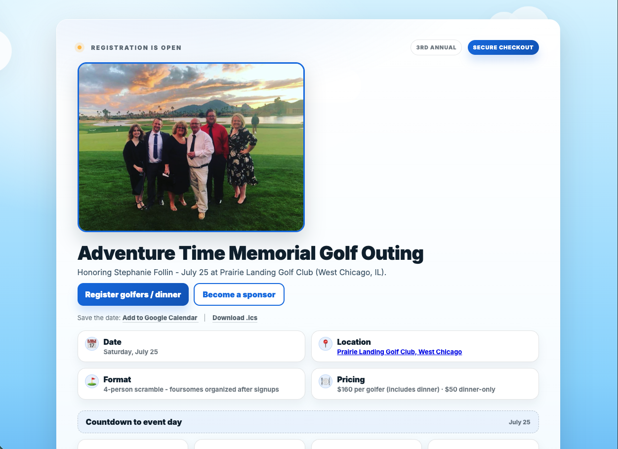
ProjectGolf outing website
Registration, sponsors, Stripe payments, confirmations, and Google Sheets logging for the organizer side.
ProjectEmpire Metal Products siteA public-facing fabrication shop site built around services, real work, forms, contractor resources, and customer questions.
ToolCut list calculatorA small tool that saves repeat math before buying material or starting a shop layout.
ToolPanel layout calculatorSimple planning help for material layout before the job gets more expensive.
Have a website or small tool idea?
Send the goal, audience, current site or spreadsheet, form/payment needs, deadline, and the thing that is wasting time right now.